
About two weeks ago, after working extremely hard day and night, each group presented their proposals and concepts to Kelley Morice, Vice Chair of the Memphis Farmers Market Board for the Farmer’s Market mural downtown. As I mentioned in the last post, the groups faced numerous design challenges, including the wall’s difficult dimensions (it is nearly 300 feet long and only 5 feet at its highest point!) and the guidelines of incorporating imagery from not only the surrounding area, but also themes related to both the Farmer’s Market and MATA. As you can see from the images below, their hard work planning and designing each proposal clearly paid off. The MFM has selected a design (which I will reveal soon!) and the students hope to fabricate and install this design in a future mural painting course.
The presentations:
Group 1: ‘Growing Memphis.’ Lucy, Grace, Alex, Devon, Amanda.
This first group focused on capturing the historically rich background of the South Main area, along with an overall sense of community, the healthy and locally produced food, and transportation—this is what inspired the title of their presentation, “Growing Memphis.” The background of their study includes graphic grayscale pictures taken by them, directly from the area, which is contrasted with the brightness of the colorful images of the places like the Lorraine Hotel and The Arcade, seen in the foreground. The group emphasized their desire to show the passage of time and to display a sense of community within their design. A few particular challenges they faced were the protruding blocks that support the green pillars at the ends of each wall [see previous post for picture] and blending the two separate walls to create one cohesive image. Between the photos they took themselves and photos they selected from the MFM Facebook page, though, they were able to unify the whole design by repeated imagery and adding faces to the podiums in order to blend them in with the rest of the faces (many of which are local Memphians!).


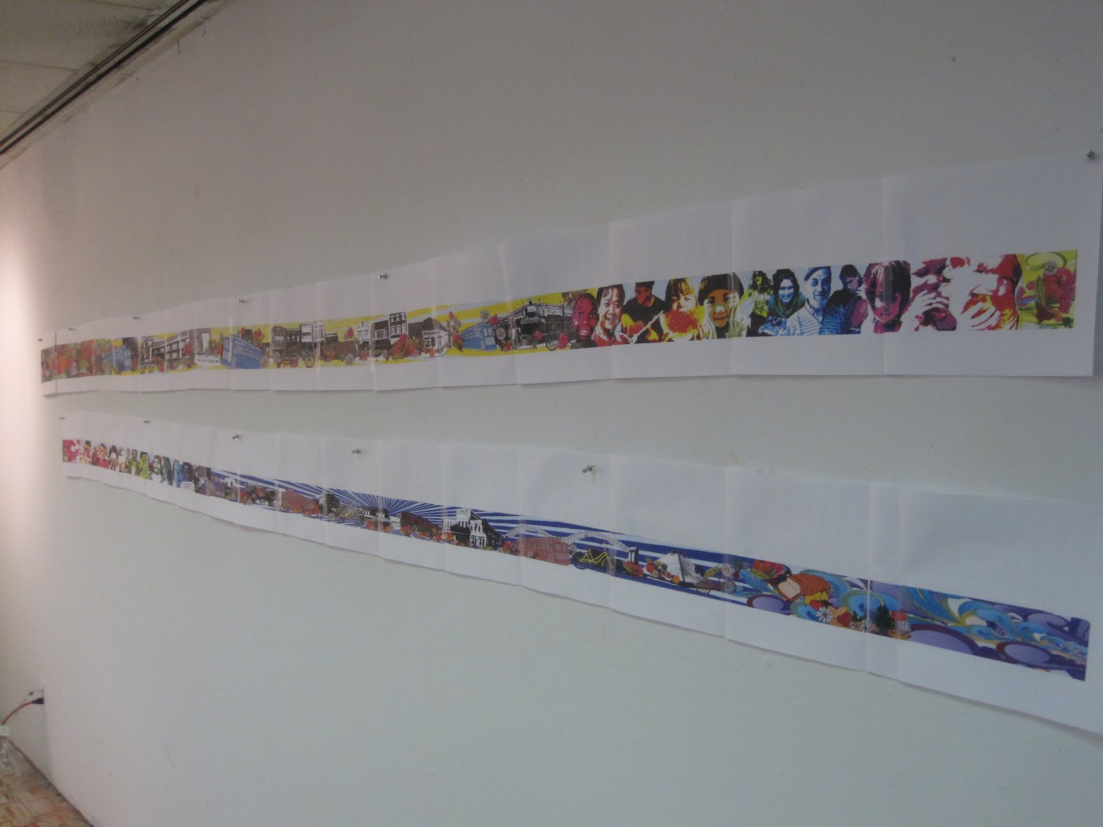
 Just a sense of the large scale of the mock-up itself...
Group 2: ‘Moving Through the Seasons.’ Brannen, Megan B., Lizz, Julia, Emily.
Inspired by the landmarks in the surrounding area, this group’s concept was whimsically depicting the South Main area as it ‘moves through the seasons’ and the colors and imagery specific to each one. They included bright and vivid colors that they felt would enhance the site overall, especially this time of year with the gloomy weather! By doing this, their composition allows bright details to jump out to the front, while the gradation in the background allows for the viewer to “drift from one season to the next.” The flags stringing across the mural both unify the composition, as well as emphasize the bright, energetic decoration of the MFM when it is in season. MATA’s role in the design is the trolleys, which appear throughout the seasons, in the mural and outside of it (in the downtown area in general). The Mississippi River bridge, area storefronts, the pyramid and signs specific to the areas are iconic and recognizable features that any passerby could relate to or connect with. Down to the details in the silhouetted skyline, every design element was carefully based on a site-specific source.


Group 3: Graham, Meg D., Erin P., Kenny, Edith
A unique aspect of this group’s presentation was that they were interested in not just incorporating the area surrounding the MFM, but also emphasized that the Farmer’s Market does not exist exclusively within the city limits—people outside of Memphis visit, support and contribute to it as well. They wanted to allow contributors, visitors, and patrons to interact and identify with the mural and simultaneously entice others to come to the market. While they included imagery from the downtown, such as the Mississippi River, they also brought in other recognizable themes of Memphis, like dogs from the dog park in Overton and musicians. Overall, their goal was to ‘poster-ize’ their design for a simpler effect, using more graphic elements and a ‘realistic color pallet.’ They wanted to construct a continuous narrative by beginning the mural with a MATA bus, making its way through the composition through farm and urban landscapes. Some areas were left not fully colorized, as they wanted to leave them open-ended to allow for more personalized insertions that relate more strongly to the community, that can be filled in later.


 A detail of the sections that they chose to leave more open-ended ^
Clearly, the MFM Board had an extremely tough decision...they thought all of the designs were very strong, but chose to use group 1's design (Growing Memphis)! There are a few revisions to be made, such as toning down the color pallet a bit, dispersing the faces more evening and adding more representations of landmarks, but overall, they thought this design would be best suited for the area. Again, the mural will not be executed by our class, but hopefully it will be by a future mural painting class!
No comments:
Post a Comment